Embed issue data as a chart
Use an Advanced Issue Macro to embed issue data as a chart. You can customise which issue field is displayed in the chart and what form of chart is used.
Start by adding an Advanced Issue Macro to a page or blog. On the issue selection modal, pick one or more issues and then click Select fields.
From the field selection view, click Display as chart from the view options at the bottom of the modal. This will switch the preview to display the selected issues as a chart.
Note that currently only the first field in the fields list will be shown in the chart.
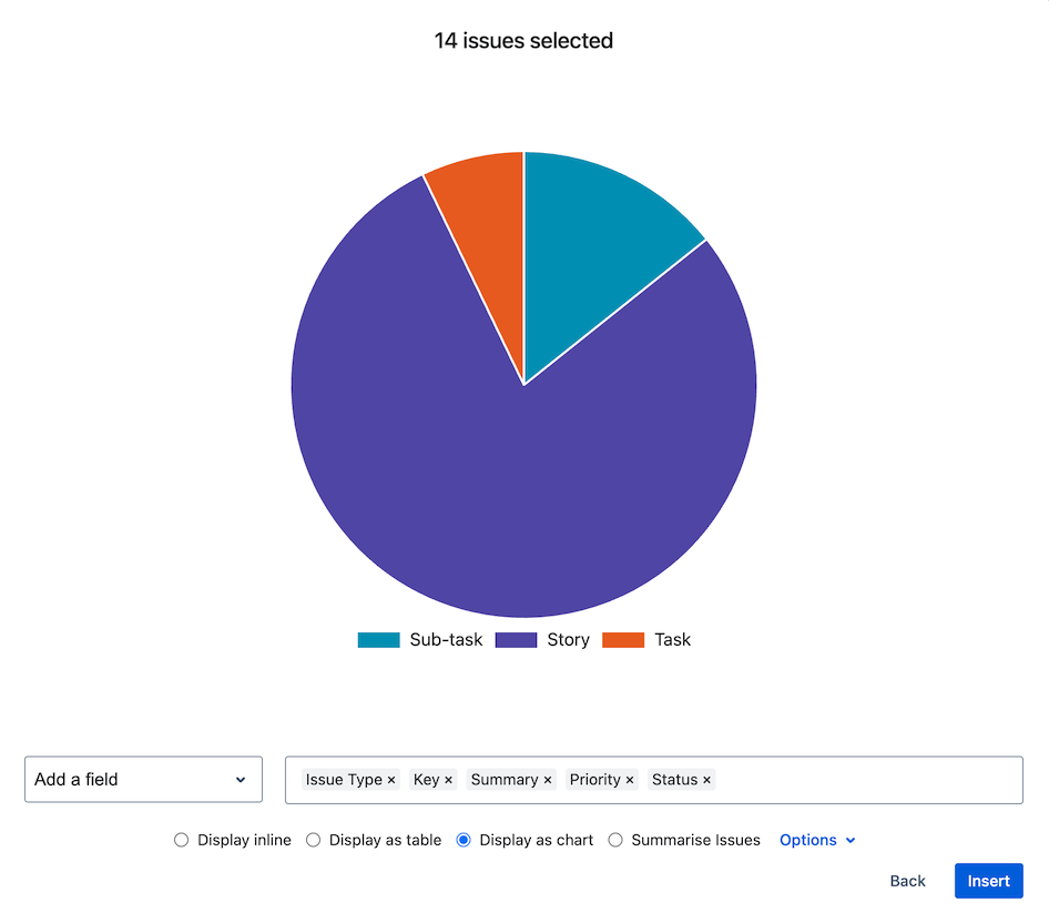
In the example below, the chart displays the ‘Issue Type’ field as it’s the first field in the fields list.
Reorder fields by clicking and dragging the field in the fields list. You can also add fields as normal using the Add a field selector.
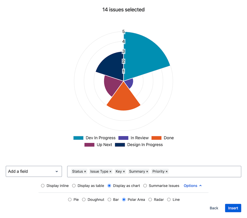
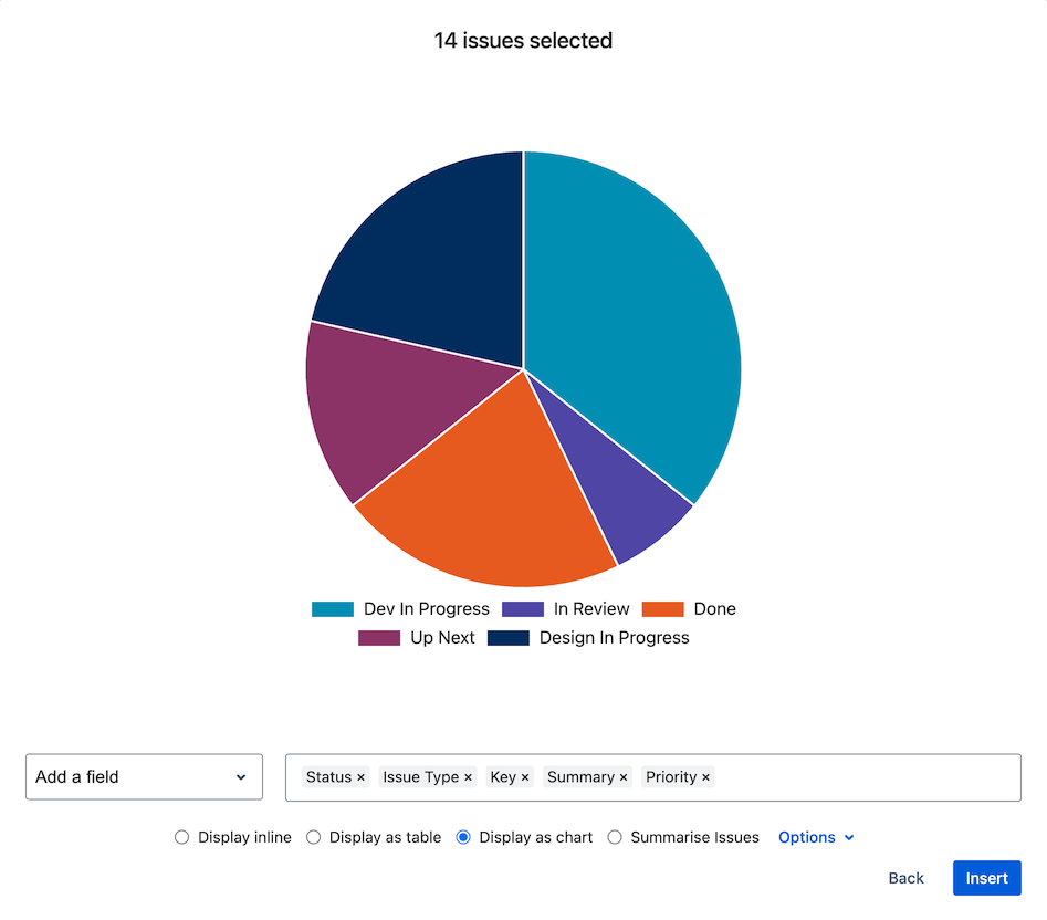
Here we have dragged the ‘Status’ field over to be first in the list. The chart preview automatically updates to show this configuration.
To be displayed as a chart, the configured issue field is summarised to show the count of each unique value across the selected issues. If a field is empty, it will be listed as ‘No value set’. An empty field can subsequently be populated in Jira and the embedded chart will automatically update to display this information.
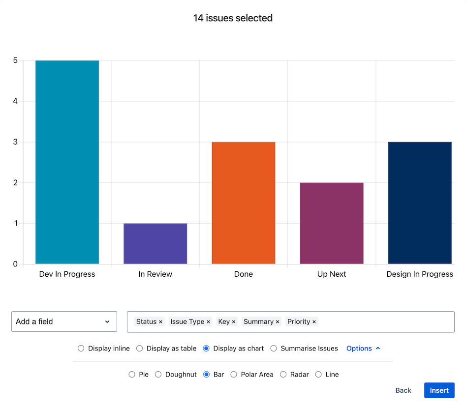
To change the chart type, click the Options dropdown and select a chart type from the list. The preview will automatically update to display the selection. The available chart options are: Pie chart, Doughnut chart, Bar chart, Polar area chart, Radar chart and Line chart.
When you have finished configuring fields, click Insert to embed the chart into Confluence. To adjust how embedded charts display, see: Resize embedded issue data